Attendance Profile
As Texas emerges from the pandemic, chronic absence and average absence rates continue to be higher than pre-pandemic rates. Preliminary analyses suggest that regular attendance continues to be strongly associated with better short-term academic outcomes for students.
Chronic absenteeism refers to students who miss 10% or more of the total number of days enrolled during a school year. This is regardless of the reason (excused, unexcused, suspensions, etc). On average, there are 180 days of school in a year. If students miss more than 18 days, school districts consider them chronically absent.
Jump to: Source and cohort information about this data.
2023-24
21%
84,524 / 399,067
Central Texas
Chronic Absence Rate
2023-24
23%
113,337 / 484,727
San Antonio
Chronic Absence Rate
Middle school grades see the lowest average days absent, while pre-K and high school grades see the highest.
Pre-K has the highest chronic absence rates.
Texas middle school students have the lowest average number of days absent
Chronic absence rates in Texas were historically stable until pandemic impact
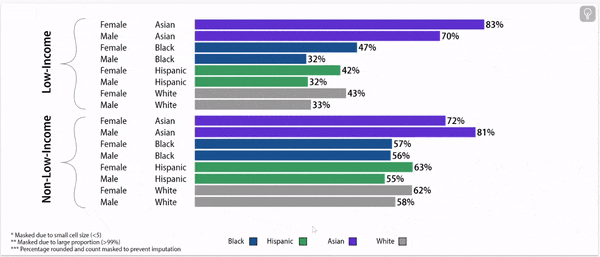
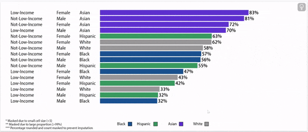
Disparities exist in chronic absence rates by household income
Disparities in chronic absence rates by household income have remained higher than pre-pandemic
Chronic absence rates vary by race/ethnicity
Disparities in chronic absence rates by race/ethnicity have remained higher than pre-pandemic
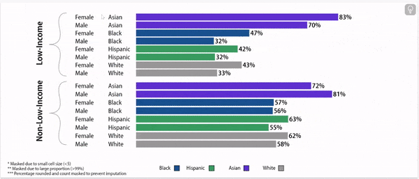
Digging deeper: chronic absence rates vary by gender, household income, and race/ethnicity
Chronic Absence Rates, 2024
About this data:
E3 Alliance relies primarily on data from the University of Texas Education Research Center (ERC). This data allows for a year-by-year understanding of chronic absenteeism based on where a student attends school. This data pertains to pre-K through 12th grade students who were enrolled within the state of Texas during a given school year.
Following are items to note:
Pandemic era data on attendance should be interpreted differently from prior years, for example, students enrolled in schools that did not report attendance data for the last 12 weeks of School Year 2019-2020 were marked as present during that time period. During the 2020-2021 school year, remote learners were often determined absent based on assignment submission timeframes.
There is a delay in data availability due to state approval within the ERC and analysis time. As such, if you choose to explore data from Central Texas, the graphs below present attendance data in the most recent available year in Texas schools.
Outcomes that reference data from 2021, 2022, or 2023 do not include San Marcos CISD, due to a data discrepancy.